



Using Elementor LearnDash together gives you a lot of freedom.
Sometimes too much freedom.
Once Elementor is available for courses, lessons, topics, and other LMS content, it is tempting to redesign everything. Course pages get custom layouts. Lessons get extra sections. Quiz screens get wrapped in new templates. Navigation gets replaced. Every course starts looking slightly different.
The result can look impressive at launch and become difficult to maintain six months later.
I prefer a simpler rule:
Use Elementor to shape the experience. Let LearnDash continue to run the learning system.
That means being ambitious with branding, presentation, course landing pages, and reusable templates, while being much more careful around progress, quizzes, enrollment, course navigation, and completion logic.
The goal is not to make LearnDash invisible.
It is to make the LMS feel like your product without rebuilding functionality LearnDash already handles well.
Elementor LearnDash: The Short Answer
I would normally divide responsibilities like this:
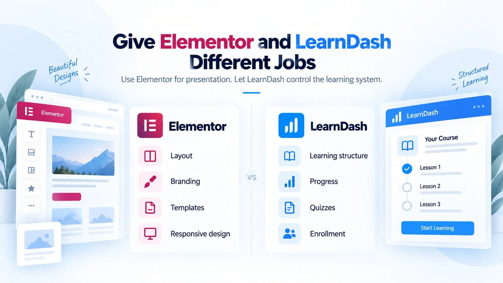
Elementor should control presentation.
That includes:
- layout
- visual hierarchy
- branding
- typography
- spacing
- responsive presentation
- marketing sections
- reusable templates
LearnDash should control learning logic.
That includes:
- course structure
- lesson and topic relationships
- student progress
- quizzes
- enrollment
- completion
- prerequisites
- learning access
LearnDash’s current Elementor integration is built around this kind of separation. It integrates LearnDash content with Elementor’s Theme Builder and LearnDash-specific widgets, and LearnDash recommends creating reusable templates rather than independently designing every course, lesson, topic, and quiz.
That is not just a convenient way to build.
It is a much more maintainable architecture.
Elementor and LearnDash Should Have Different Jobs
I do not see Elementor and LearnDash as competing for control of the page.
They solve different problems.
Elementor answers questions such as:
- What does this page look like?
- How is information arranged?
- What visual hierarchy should the learner see?
- How does the layout behave on mobile?
- How does this page match the brand?
LearnDash answers questions such as:
- Which lesson comes next?
- Has this student completed the previous topic?
- Is the learner enrolled?
- What percentage of the course is complete?
- Can this user take the quiz?
- Has the course been completed?
That distinction becomes more important as the LMS grows.
If Elementor starts being used to reproduce functionality already controlled by LearnDash, you now have two layers trying to solve the same problem.
That creates more code, more testing, and more ways for future updates to break something.
What Elementor Is Good At
There are plenty of areas where I would use Elementor without hesitation.
Brand presentation
Elementor is useful for defining:
- colors
- typography
- spacing
- buttons
- content widths
- visual hierarchy
A LearnDash platform does not need to look like an out-of-the-box LMS.
Reusable page layouts
This is one of the most valuable uses of Elementor.
Instead of manually designing every course, you can build a reusable presentation system around dynamic LearnDash content.
Responsive design
Course discovery pages, sales pages, instructor sections, pricing blocks, FAQs, and other supporting content can all be adapted carefully across desktop, tablet, and mobile.
Marketing content
This is where I would give Elementor the most freedom.
The pages responsible for explaining and selling the learning product are primarily presentation problems.
LearnDash does not need to control them.
What LearnDash Should Continue to Control
There are other parts of the platform where I would be much more conservative.
That includes:
- the course hierarchy
- progress tracking
- lesson completion
- topic completion
- quiz state
- enrollment
- prerequisites
- access rules
- course progression
These are not simply visual elements.
They represent student state.
If you change how a heading looks and something goes wrong, the heading looks wrong.
If you change how course completion works and something goes wrong, a learner may lose access, fail to progress, or receive the wrong completion state.
Those are very different risks.
Course Landing Pages: Customize Them
The course landing page is usually where I would give Elementor the greatest freedom inside the LMS itself.
This page often has two jobs:
1. explain the course
2. help the visitor decide whether to enroll
That makes it closer to a product page than an actual learning screen.
I would comfortably customize sections such as:
- course hero
- summary
- learning outcomes
- instructor profile
- curriculum preview
- testimonials
- FAQs
- pricing
- membership options
- call to action
The visual design can be completely different from LearnDash’s default presentation.
Underneath that design, LearnDash can still remain responsible for the actual course.
That is the combination I want.
Custom presentation. Stable LMS logic.
Course Templates: Customize Once, Reuse Everywhere
This is where the difference between a good Elementor implementation and an expensive one becomes obvious.
Imagine a site with 40 courses.
You have two options.
Option A
Design all 40 course pages independently.
Each course gets its own Elementor structure.
It gives you maximum freedom.
It also gives you 40 layouts to maintain.
Option B
Create a strong global course template and let dynamic course content populate it.
Now the visual system lives in one place.
LearnDash’s own Elementor documentation recommends using Theme Builder templates rather than editing individual LearnDash content items because global templates make later changes much easier to manage.
I strongly prefer the second approach unless a particular course genuinely needs a different experience.
If the business later decides to:
- move the progress block
- change title spacing
- update typography
- add instructor information
- adjust mobile layout
you update the template.
You do not open 40 courses.
Lessons and Topics: Be More Conservative
The deeper someone moves into the learning experience, the less visual experimentation I usually want.
A lesson page has a simple job:
help the learner consume the lesson and continue.
It needs:
- clear content
- readable typography
- predictable navigation
- visible progress
- obvious completion actions
- minimal distraction
That is very different from a marketing page.
You can still improve the presentation.
You might change:
- content width
- typography
- spacing
- video placement
- callout styling
- resource sections
But I would be reluctant to turn every lesson into an elaborate Elementor page.
The student is no longer deciding whether to buy.
They are trying to learn.
Why Focus Mode Should Usually Stay LearnDash-Controlled
LearnDash already has a dedicated learning environment called Focus Mode.
When enabled, it applies to lessons, topics, quizzes, and assignments. It removes normal site navigation, footers, and sidebars, while keeping course navigation, progress, next/previous navigation, and completion actions visible.
That is a good example of functionality I would not rebuild casually.
Focus Mode solves a real product problem:
how do we remove distractions while keeping the learner oriented inside the course?
You may want to style the environment to match your brand.
That is reasonable.
But replacing the whole experience with a custom Elementor structure means taking responsibility for all of the learning states and navigation behavior that LearnDash already handles.
There needs to be a good reason for doing that.
Customize More Here, Less Here
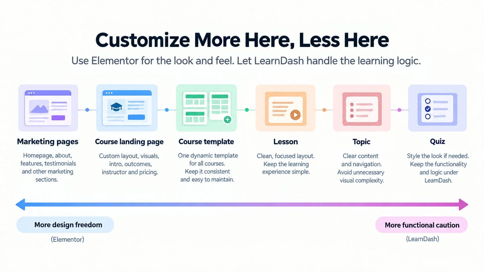
I think about customization as a spectrum.
Marketing pages
High design freedom
These pages can be heavily customized because they are mainly responsible for positioning, persuasion, and presentation.
Course landing pages
High design freedom
You can create a distinctive branded experience while still allowing LearnDash to handle the course underneath.
Course templates
Moderate to high design freedom
Customize strongly, but do it through a reusable system.
Lessons
Moderate caution
Presentation can change, but navigation and course behavior should remain predictable.
Topics
More caution
The learner is deep inside the course flow. Clarity matters more than decoration.
Quizzes
High functional caution
Style them where appropriate, but avoid replacing the mechanics without a specific technical requirement.
The rule becomes:
The closer a component gets to student state and learning logic, the more careful I become with customization.
Quizzes: Styling Is Fine, Rebuilding the Experience Is Riskier
A quiz is not just another page.
It has:
- questions
- answers
- validation
- navigation
- attempts
- scoring
- results
- completion behavior
Potentially it also has:
- certificates
- timers
- essay questions
- prerequisites
- retake rules
Changing the visual presentation is one thing.
Changing how that interaction behaves is another.
Changes I am usually comfortable with
- typography
- colors
- spacing
- borders
- surrounding layout
- feedback styling
- visual polish
Changes I would test much more carefully
- replacing quiz navigation
- modifying submission behavior
- custom JavaScript around answers
- changing completion behavior
- altering state-dependent interactions
Once the customization affects functionality rather than presentation, Elementor is no longer really the main problem.
It becomes custom LMS development.
Course Navigation and Progress Should Stay Predictable
It is easy to underestimate how important consistency is inside an LMS.
A student should not need to relearn the interface every time they move between courses.
They should quickly understand:
- where they are
- what they completed
- what comes next
- how to continue
- how to return to the course
I would therefore be careful about replacing standard LearnDash navigation purely because a completely different design looks more interesting.
Good course UX is not about making every screen unique.
It is often about making important actions boringly predictable.
Course Grids: Do Not Rebuild Something Just Because Elementor Can
Course directories are another place where unnecessary customization happens.
LearnDash’s current Course Grid supports features including:
- columns
- sorting
- categories and tags
- enrolled-course filtering
- images
- video previews
- descriptions
- CTA buttons
- progress bars
- search
- filtering
- different skins
LearnDash also notes that Course Grid can be inserted through a shortcode when using page builders such as Elementor, although its WordPress block currently exposes more options than the shortcode implementation.
That creates an important decision.
If LearnDash Course Grid already provides the behavior you need, I would usually style or integrate that functionality rather than manually reconstructing all of it with Elementor.
But if the business needs a very different browsing experience, for example complex filtering or highly custom product cards, then a custom implementation might make sense.
The decision should come from the product requirement.
Not from the fact that Elementor happens to be installed.
Student Dashboards Need More Thought Than Landing Pages
Student dashboards are one area where custom design can add significant value.
A good dashboard might bring together:
- active courses
- progress
- certificates
- membership information
- upcoming learning
- account details
- community access
But dashboards also contain a lot of dynamic information.
That means I would treat them differently from a static page.
Before building a highly customized Elementor dashboard, I would ask:
- How many dynamic queries are required?
- Does every widget need to load immediately?
- Does LearnDash already expose the required data?
- Is another plugin supplying the data?
- Will the dashboard still be maintainable later?
- What happens with thousands of learners?
Sometimes Elementor is appropriate.
Sometimes a custom template or development work is cleaner.
What Happens When You Design Every Course Individually
This approach often feels harmless at the beginning.
The business has three courses.
Each gets its own Elementor design.
No problem.
Then the platform reaches:
- 10 courses
- 20 courses
- 50 courses
Six months later, someone decides that every course should have a new progress section.
Now the team needs to determine whether that block exists consistently across dozens of independent layouts.
Then mobile spacing needs changing.
Then a new enrollment message needs adding.
Then the brand typography changes.
The original flexibility has turned into maintenance debt.
That is why I prefer:
design system → template → dynamic LMS content
rather than:
course → custom page → another custom page → another custom page
The Maintenance Cost of Over-Customization
Customization is not free after launch.
Every customized layer adds future questions.
Will it survive:
- LearnDash updates?
- Elementor updates?
- PHP updates?
- responsive changes?
- new course types?
- new membership rules?
- design-system changes?
This does not mean you should avoid customization.
It means customization should earn its place.
I would happily create a custom component that improves an important user journey.
I would not create ten custom components simply to make LearnDash look less like LearnDash.
Those are different objectives.
This is also why the build cost of a LearnDash website is not just the plugin licence. I covered the broader implementation and ownership factors in How Much Does a LearnDash Website Really Cost in 2026?.
Performance Considerations
Elementor is not automatically the reason a LearnDash site becomes slow.
But it can contribute to the problem when the platform is overbuilt.
For example:
- deeply nested containers
- unnecessary widgets
- duplicate sections
- excessive JavaScript
- third-party widget packs
- animation everywhere
- large images
- too many fonts
- unnecessary scripts on learning pages
A course landing page can tolerate more presentation complexity than a lesson students will load repeatedly.
That is another reason I reduce design complexity as the user moves deeper into the LMS.
If the platform is already experiencing performance problems, I would diagnose the whole system rather than blaming Elementor by default. I covered that process in Why LearnDash Websites Become Slow and What Actually Fixes Them.
When Custom CSS Is Better Than Another Elementor Widget
Sometimes a design problem does not need another widget.
Suppose you want to change:
- button appearance
- course progress styling
- lesson spacing
- heading typography
- border radius
- quiz colors
If the underlying HTML already contains everything you need, a focused CSS adjustment can sometimes be cleaner than adding another Elementor component or third-party addon.
That has advantages:
- less markup
- fewer dependencies
- easier global changes
- potentially less front-end weight
The key is keeping the CSS organized and maintainable rather than accumulating random overrides.
When Custom Development Is Better Than Elementor
Elementor is excellent at visual composition.
It is not supposed to replace application development.
If the requirement involves things like:
- unusual progress behavior
- advanced student dashboards
- dynamic enrollment logic
- custom reporting
- external APIs
- complex user state
- conditional course workflows
I would consider custom development rather than forcing everything through Elementor widgets and visibility rules.
A simple question helps:
Is this a layout problem or a logic problem?
If it is a layout problem, Elementor may be the right tool.
If it is a logic problem, treat it as software.
A Maintainable Elementor + LearnDash Setup
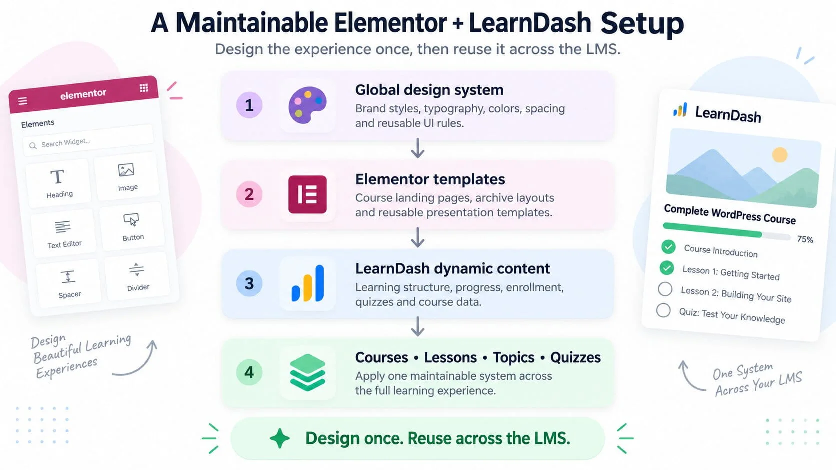
The architecture I prefer looks like this:
1. Global design system
Define:
- colors
- typography
- spacing
- buttons
- reusable visual rules
2. Elementor templates
Use reusable templates for:
- course presentation
- relevant archives
- marketing sections
- supporting layouts
3. LearnDash dynamic content
Allow LearnDash to provide:
- learning structure
- progress
- enrollment
- quizzes
- course data
4. Courses, lessons, topics, and quizzes
The individual learning objects use the system above instead of each becoming an independent design project.
That gives the business one place to change the design while preserving LearnDash as the functional layer.
Design once. Reuse across the LMS.
What I Would Customize on a New LearnDash Build
If I were planning a new Elementor + LearnDash platform, I would normally prioritize customization here:
Course sales and landing experience
Make the value of each course easy to understand.
Global course presentation
Create one strong reusable course template.
Brand system
Make LearnDash feel visually consistent with the wider website.
Course discovery
Create a clear course directory or archive appropriate to the business model.
Responsive experience
Test the actual learning journey on mobile rather than only checking marketing pages.
Supporting information
Use Elementor for instructor information, FAQs, testimonials, pricing explanations, membership comparisons, and other supporting content.
These are places where visual design can genuinely improve the product.
What I Would Leave Alone
Unless the project has a specific requirement, I would usually preserve LearnDash’s responsibility for:
- lesson completion
- topic progression
- course completion
- quiz mechanics
- course hierarchy
- enrollment state
- prerequisites
- access logic
- progress tracking
Those are core LMS responsibilities.
They can still be integrated into a custom visual system without replacing how they work.
What I Would Customize Only With a Clear Reason
There is also a middle category.
I would customize these when the business case is strong, but not automatically:
- student dashboards
- lesson navigation
- quiz interfaces
- course-grid internals
- Group interfaces
- custom enrollment flows
- account areas
These can materially improve the user experience.
They can also create much more implementation and testing work.
The right question is not:
“Can Elementor customize this?”
Usually it can.
The question is:
“Does customizing this create enough value to justify owning the customization?”
Elementor, LearnDash and BuddyBoss
The boundary becomes even more important when BuddyBoss is part of the same platform.
Now there may be three layers:
Elementor
Presentation.
LearnDash
Learning.
BuddyBoss
Community.
Problems start when those responsibilities become blurred.
For example, if Elementor, LearnDash, BuddyBoss, and a membership plugin are all independently being used to determine what a user should see, the site becomes much harder to reason about.
I covered the separation between the learning and community layers in LearnDash + BuddyBoss: How the Architecture Should Actually Work.
Elementor should normally sit around that architecture rather than becoming another access-control layer inside it.
Good Architecture Also Makes Future Migration Easier
There is another advantage to using reusable templates and keeping LMS logic inside LearnDash.
The platform becomes easier to move.
If every course contains highly customized Elementor structures, custom widgets, and special logic, a future redesign or migration has more dependencies to preserve.
A cleaner separation between content, presentation, and LMS state reduces that complexity.
I covered the data side of that problem in Migrating LearnDash Without Losing Student Progress.
A maintainable site is not just easier to edit today.
It gives you more options later.
Final Recommendation
Elementor and LearnDash work well together when each tool is allowed to do what it is best at.
Use Elementor aggressively where the problem is visual:
- branding
- page composition
- course presentation
- responsive layouts
- reusable templates
Be more conservative where the problem is functional:
- progress
- quizzes
- enrollment
- completion
- navigation
- access
And when the requirement moves beyond presentation into real application logic, consider whether custom development is cleaner than stretching Elementor further.
The goal is not to customize every screen.
It is to build a learning platform that feels custom without becoming unnecessarily custom underneath.
That distinction matters when the LMS grows, when the design changes, when plugins update, and when another developer eventually has to maintain the platform.